What goes up must go down, or up, or nowhere
10. Correlations
Correlations are one of the most frequently used statistical tests and for good reason. They allow comparisons between continuous variables and yield how strongly these variables are related to one another in a dataset. You can test to see how much happiness and income are correlated, how much rain is associated with the number of wildfires, and how much carbon dioxide that a country produces is associated with the country’s gross domestic product (a typical measure of a country’s economic health). Many correlation tests exist and we will discuss a basic yet powerful test- the Pearson correlation test, named after Karl Pearson. (Interestingly, this test has many names including the correlation coefficient, Pearson’s correlation, Pearson correlation coefficient, Pearson’s product-moment correlation. We will call the test the Pearson correlation test for consistency.
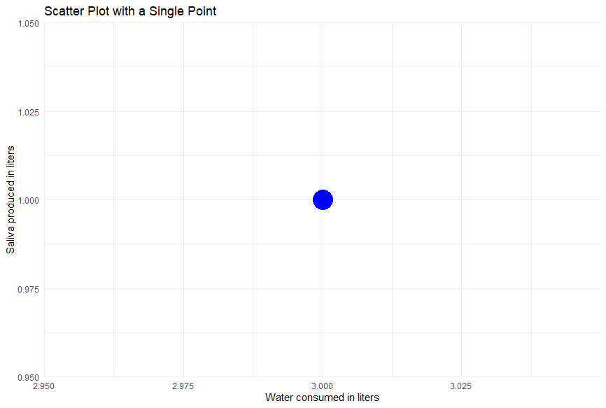
Let’s say we plot two dog-related continuous variables on a graph: water consumption and saliva production. You might assume that the more water a dog consumes is associated with higher saliva production. We do our magical testing of many dogs per usual to determine their water consumption and saliva production. We plot water consumed on the x-axis of a graph and saliva production on the y-axis. Each dog has a value for both of these values, and where they meet on the graph is where we put a point. Let’s say 1 dog consumes 3 liters of water and produces 1 liter of saliva. We would move to 3 on the x-axis and up 1 on the y-axis to place our point
for the 1 dog. The scatterplot below shows the single point.
Of course, we can plot all the data for the dogs we sampled. We happened to sample 30, which when plotted on the scatterplot, looks like the figure below.
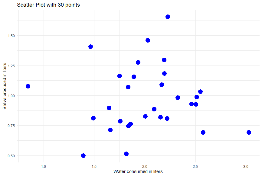
Scatterplots are a great way to visualize if two continuous variables might be correlated.
You can learn more about constructing a scatterplot and visualizing correlations in the videos below from Khan Academy: Visualizing two continuous variables via a scatterplot and Identifying correlations.
Visualize scatterplots with real data (Internet use, carbon footprint, sandwiches) with another R Shiny app
Create your own scatterplot below!
The scatterplots can give us an intuition about how water consumption might be related, but not by how much. This is the reason we use the Pearson correlation test! The Pearson correlation test is a statistical tool used to examine the strength and direction of the linear relationship between two continuous variables. An important note is that this test cannot tell us causation! We cannot say what variable causes the other, or if there is causation at all. A good example of this is that the number of churches and fast food restaurants are correlated with one another in a city, but do more churches cause more fast food restaurants? No, instead the population of a city is the likely cause of church and fast food restaurants numbers, even though churches and fast food could be correlated with one another.
Correlations are still very helpful as we can’t always determine causation. In health research, we can’t force people to smoke to determine the effects of cigarettes, so we might look at the number of cigarettes someone smokes and their lifespan. One study doesn’t prove smoking causes a shorter lifespan, but if we repeat the study many times and combine it with other research (maybe testing the effect of smoke on human lung cells), we get closer to the fact that smoking leads to shorter lifespans. If we go back to our favorite hypothetical scenario- the one we all voted on that was the absolute best ever –dogs– we can investigate if the amount of water a dog drinks correlates with the amount of saliva it produces.
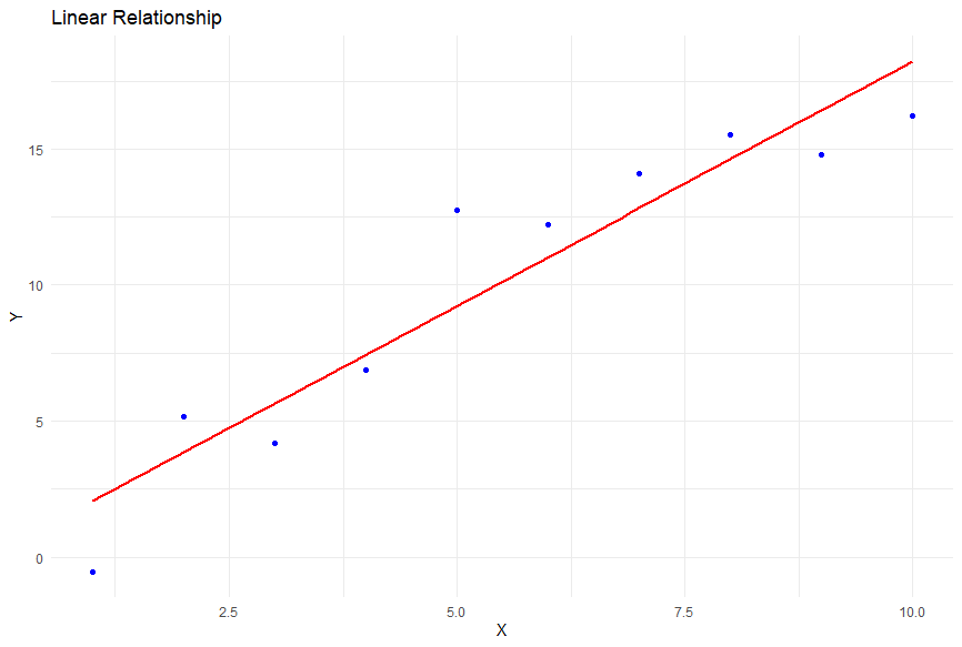
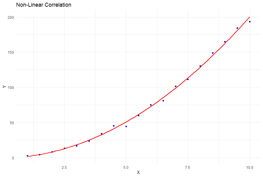
Before we determine if the increase in water consumption is correlated with an increase in saliva, like any other statistical test, we need to satisfy certain assumptions for a Pearson correlation test. Firstly, the variables of interest should be continuous. Secondly, the relationship between the variables should be linear, meaning the data points tend to follow a straight line pattern like the figure above (ie., as one variable goes up or down, so does the other in a way that isn’t a square root, exponent, logarithm, etc). An example of a non-linear correlation is in the figure below. Lastly, we assume that the variables are normally distributed, meaning they follow a bell-shaped curve, like so many of the other statistical tests we’ve mentioned.
Next, we establish our hypotheses. As you may have guessed by now, the null hypothesis (H0) in Pearson’s correlation test states that there is no correlation between the two continuous variables, as in there would be no correlation between the amount of water consumed by dogs and the amount of saliva they make. (Maybe all the wet puddles around the kitchen are just drips from the dog’s mouth after they drink water and not technically saliva). The alternative hypothesis (Ha) suggests that there is a significant linear relationship- water consumed and saliva production for dogs is correlated.
As with all other statistical tests, we calculate a test statistic and match that to a p-value. The test statistic in the Pearson correlation test is the correlation coefficient, denoted as r. The correlation coefficient ranges from -1 to +1, where -1 indicates a perfect negative linear relationship, +1 indicates a perfect positive linear relationship, and 0 indicates no linear relationship. A negative correlation would mean as one variable increases, the other decreases- more water consumed is correlated with less saliva production in dogs. A correlation of 0 means the variables are not correlated with each another- more water consumed has no pattern with saliva production in dogs. A positive correlation indicates an increase in one variable matches an increase in the other variable - increased water consumption is correlated with increased saliva production.
Boost your correlation coefficient intuition with this video and learn how to calculate correlation coefficient with yet another video from Khan Academy.
Once we have our test statistic, the r-value, we can compare it to the t-distribution to find a p-value. Interpreting the p-value involves comparing it to a predetermined critical threshold, commonly set at 0.05 (5%). If the p-value is less than the critical threshold (p < 0.05), we reject the null hypothesis in favor of the alternative hypothesis. This indicates that there is evidence to support the claim that the amount of water consumption is significantly correlated with saliva production in dogs. If the p-value is greater than or equal to the critical threshold (p ≥ 0.05), we fail to reject the null hypothesis.
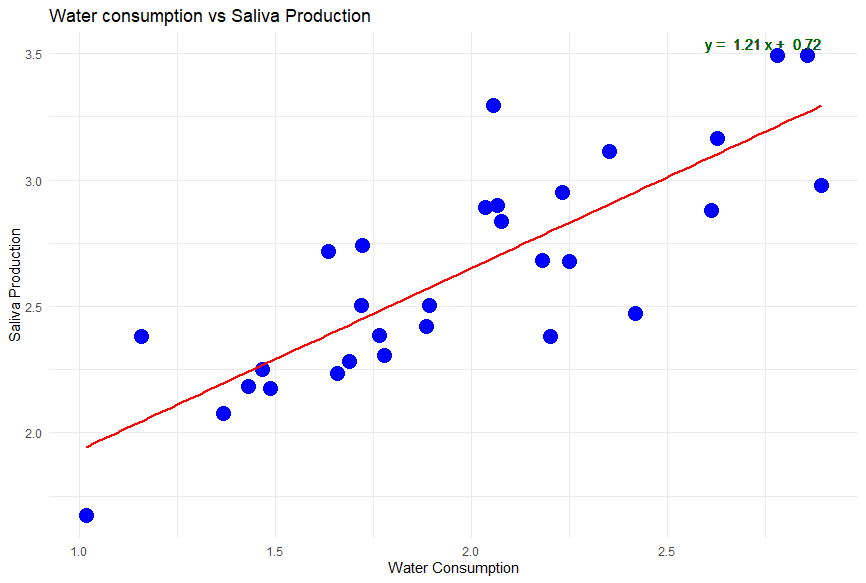
Let’s say we do the calculations and find there is a significant association at r=0.8 between water consumption and saliva production for our 30 dogs. That’s great! It’s probably what we would expect. That gives us the strength of the association AKA correlation between water consumption and saliva production, but the rate of change. You may want to predict how much a dog will drool on average depending on it’s water consumption. This is where regression lines come into play! For linear relationships, the rate of change between your independent variable, water consumption, and dependent variable, saliva production, is a line equation - y = M(x) + b.
Here, x is your independent variable and y is your dependent variable, with m being the slope AKA the rate of change. The lines on the scatterplots above have been calculated to best fit the data and are the best line to match the rate of change between variables. If the regression line is saliva production = 1.21(water consumption) + 0.72 (like the scatterplot below), you can estimate with every increase of 1 liter in water consumption, there is most likely an 1.21 liter increase in saliva production starting at minimum of 0.72 liters of saliva that will be produced.
To learn how to calculate a regression line, learn from our friends at Khan Academy.
Visualize regressions with real data below:
In more advanced statistical analysis, researchers often use multiple regression techniques. Multiple regression allows us to predict or estimate the value of one outcome variable based on the value of one or more variables. Linear regression is a highly used technique in business, science, engineering, math- almost any field!- and it examines how one variable (the dependent variable) changes as one or more variables (the independent variables) change. This technique provides more detailed information about the relationship between variables, including the impact of other factors and the ability to make predictions. Instead of just seeing if water consumption and saliva are correlated in dogs, we could test if age of a dog, the breed, time exercising, and/or water consumption is associated with saliva production at the same time! Or, you could compare how your education, age, and years of experience can be used to estimate how much you should make in a future job and make sure you get paid to your liking!
| Hypothetical Multiple Regression Analysis Results |
|---|
| Dependent Variable: Saliva Production |
| R-squared: 0.65 |
| Coefficient | Std. Error | t-value | p-value | |
|---|---|---|---|---|
| Intercept | 10.50 | 0.80 | 13.13 | <0.001 |
| Dog Age (in years) | -0.25 | 0.05 | -5.00 | <0.001 |
| Dog Breed (Breed B vs A) | 1.20 | 0.40 | 3.00 | 0.003 |
| Time Exercising (in hours) | 2.75 | 0.30 | 9.17 | <0.001 |
| Water Consumption (in ml) | 0.05 | 0.01 | 5.00 | <0.001 |
Note:
- The variable “Dog Breed” is a categorical variable. In this illustration, it’s been dummy coded comparing Breed B to a reference Breed A.
- The R-squared value indicates that 65% of the variance in Saliva Production can be explained by the independent variables in the model.
- The p-values suggest the level of significance for each variable, with values <0.05 typically indicating significance in many fields.
To summarize, the Pearson correlation test is an incredibly valuable statistical tool used to assess the correlation between continuous variables. It, along with regression tests, is used frequently in business, agriculture, economics, psychology, medicine… really anything! (That’s also a bonus of having a job in statistics and data science- you are always useful and in demand!). Understanding how to use correlations and understanding that correlation does not mean causation, can help you be a savvy consumer of information, and even test if claims you see on the Internet are true.
In our last lesson (hold back the tears), we’ll discuss how messy data can halt analysis and other considerations we should make to ensure the tests we run are a good and appropriate fit for our data. Maybe you’ve tried calculating germination rates of plants for a school project that should last a few days, but nothing sprouts for weeks! Often, it’s making sure the data is clean and ready to use that takes longer than the statistical tests to get results- we’ll see why.
Correlations in statistics measure the relationship between two continuous variables, indicating how closely they move together. However, they don’t prove causation, meaning a high correlation doesn’t necessarily mean one variable causes changes in the other.